I have to say I'm not a huge comic book fan (although I was brought up on children's comics such as Rupert the Bear and Beano). But I just fell in love with Ware's comic book style as it is so graphic; beautifully laid out and disarmingly lighthearted. Amazingly he draws all these precise images by hand using 'old skool' techniques such as pencil, rulers, compasses, set squares etc so no computers are involved in the process. The amount of detail he adds to his pages is just outstanding and they have a very filmic feel about them, especially when he pans out on an image or magnifies it.
Tuesday, 30 June 2009
Chris Ware
Monday, 29 June 2009
Pen-Paper-Scissors at the V&A
Three illustrators from each agency went head to head against the clock (they had an hour) and could only use black pens to draw on the white boards. They also weren't allowed to prep beforehand. The illustrators were: Chris Price, Craig Ward and Serge Seidlitz from Debut Art (the board on the left) and Noma Bar, Dermot Flynn and Kustaa Saksi from Dutch Uncle.
I was of course biased, but the best team won, it was 3-0 to Debut (two judges votes plus the audiences). A good night was had by all. The rest of the weekend we spent painting, of a different kind...dreaded decorating!
Friday, 26 June 2009
Roos invade London
Twenty of these life-sized Roos have popped up over London for a week to promote Kangaroo Island and South Australia as a tourist destination - as if it needs it!
They have been each uniquely designed by South Australian and UK celebrities, students, artists and sponsors such as Elle Macpherson, GMTV presenter Richard Arnold and South Australian artists Peter Coad and Emma Hack. At the end of the promotion they will be auctioned off for charity.
Once you have spotted all 20 kangaroos go here to enter to win a trip for four to Adelaide and Kangaroo Island.
Thursday, 25 June 2009
Somewhere over the rainbow...
Her houses balance on stings, stilts or are strewn as debris but they all play characters in her narrative, inspired by a reoccurring nightmare:
For me the earthy sepia-esque tones; her eye for detail and the playful compositions, depicting fragility of the way houses are built so close to each other, are what I like the most. I hope that I get to see her work exhibited soon.
Wednesday, 24 June 2009
Toynbee Tiles
The graffiti tiles tend to be located in the middle of busy streets and highways where they wear away quickly or instead they resurface. Apparently tiles are wrapped in tar paper and placed on a busy street early in the morning, then the pressure of heavy vehicles driving over them for weeks on end pushes it into the road surface. Eventually, the tar paper wears away, exposing similar messages:
TOYNBEE IDEA MOVIE 2001 RESURRECT (sometimes "RAISE") DEAD PLANET JUPITER
The tiles might be made of layers of linoleum and asphalt crack-filling compound, but again no-one is sure. I think that something so cryptic that can cause such controversy is just fabulous, but it does annoy me that I might never find out what they are for!
Tuesday, 23 June 2009
Madewell
Monday, 22 June 2009
Letterpress
The letterpress collection in Tor Pettersen reminds me these unique woodletter collages from The Old Printing Shop. They are also inset in the original type trays, that have been cut to size, which I think is a nice touch. A larger version would make for a very lovely coffee table.
Sunday, 21 June 2009
Bermondsey Street
Saturday, 20 June 2009
Hartley's Jam Factory
Hartley's jam factory was built in 1901 and can be found between London Bridge and the Old Kent Road. In 1999 plans were in place to convert the factory into live/work warehouse/loft spaces, mixing the old with the new. The site is an impressive 285,000 sq ft. The factory's blueprint lofts and penthouses were pre-designed by some of Britain's leading young architects, such as the likes of Ian Simpson, Maya Vuksa, Paul Daly, Azman Owens and Softroom.
The flats (some spanning two floors) are impressive and have been converted beautifully whilst still keeping lovely elements of what it used to be. I've always had a huge soft spot for any kind of conversion - whether it's a Victorian school; church; barn or factory the Jam Factory certainly didn't disappoint.
Friday, 19 June 2009
Ladder bookcase
This 'Ladder Bookcase' is designed by Autoban (Seyhan Özdemir & Sefer Çaglar) for De La Espada. Although it is too expensive for me, you can't deny this gorgeous handcrafted ladder bookcase is worth every penny. Its unusual height (over eight feet tall) and slim profile make it versatile and the lowest rung is the ideal height for a nightstand or side table. Oh well...
Thursday, 18 June 2009
Good as Gauld
Their first comic book together was aptly named First and they then followed it with Second. Later on they published both editions in one book entitled Both. They do their own stuff too and I've picked up a few of their editioned comic books in my favourite London bookshop - Magma. Tom is one of my favourite all time illustrators. I just love his sharp-witted and simple line drawings. If I could draw like him, I wouldn't stop! My favourite is The Hairy Monster a guide - 7 plates drawn by Tom Gauld in edition of 500 copies (2006).
Wednesday, 17 June 2009
kozyndan
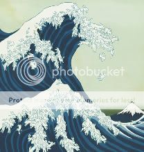
Rabbits have become their hallmark - mainly because they had rabbits at home and they became their only life models. This is certainly apparent in the images above; if you look closely you'll see the waves, blossoms and leaves etc are all made up of hundreds of bunnies! There are also nod's to Kozy's native country, Japan, with the use of Japanese parchment textures and the references to Hokusai. Their witty urban landscapes are amazingly detailed.